Skeleton Loading Screen Using CSS
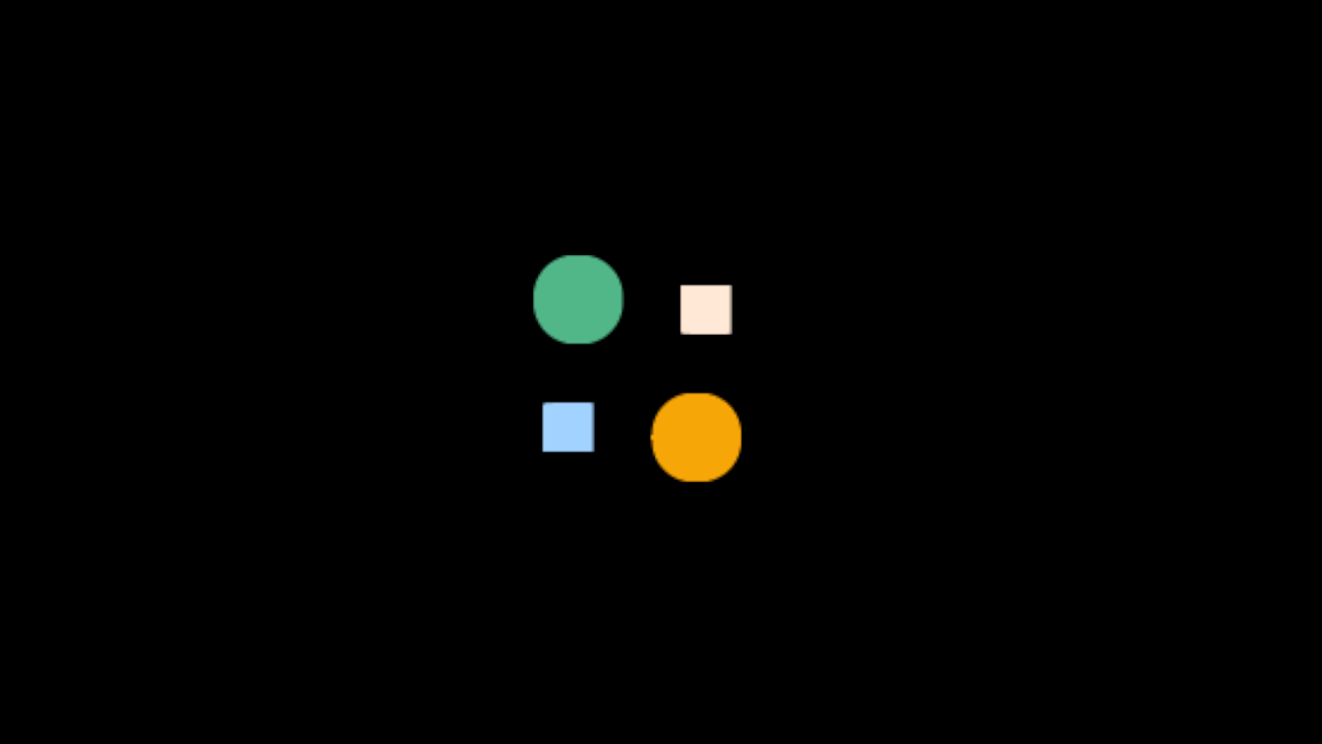
OUTPUT
HTML
  <div class="main">
    <div class="card">
      <div class="process-skeleton image"></div>
      <div class="process-skeleton title"></div>
      <div class="process-skeleton price"></div>
      <div class="process-skeleton rating"></div>
    </div>
  </div>
CSS
  body{
    background-color: #000;
  }
  .main{
    display: flex;
    justify-content: center;
  }
  .card{
    border-radius: 8px;
    width: 300px;
    background: #fff;
    padding: 10px;
  }
  .process-skeleton{
    background-image: linear-gradient(90deg,
              #ccc 0px,
              rgb(229 229 229/ 90%) 40px,
              #ccc 80px);
    background-size: 300%;
    background-position: 100% 0;
    border-radius: inherit;
    animation: shine 1.5s infinite;
  }
  .image{
    height: 200px;
    margin-bottom: 10px;
  }
  .title{
    height: 10px;
    margin-bottom: 5px;
  }
  .price{
    height: 15px;
    width: 100px;
    margin-bottom: 5px;
  }
  .rating{
    height: 20px;
    width: 200px;
  }
  @keyframes shine{
    to{
      background-position: -100% 0;
    }
  }

Trending